

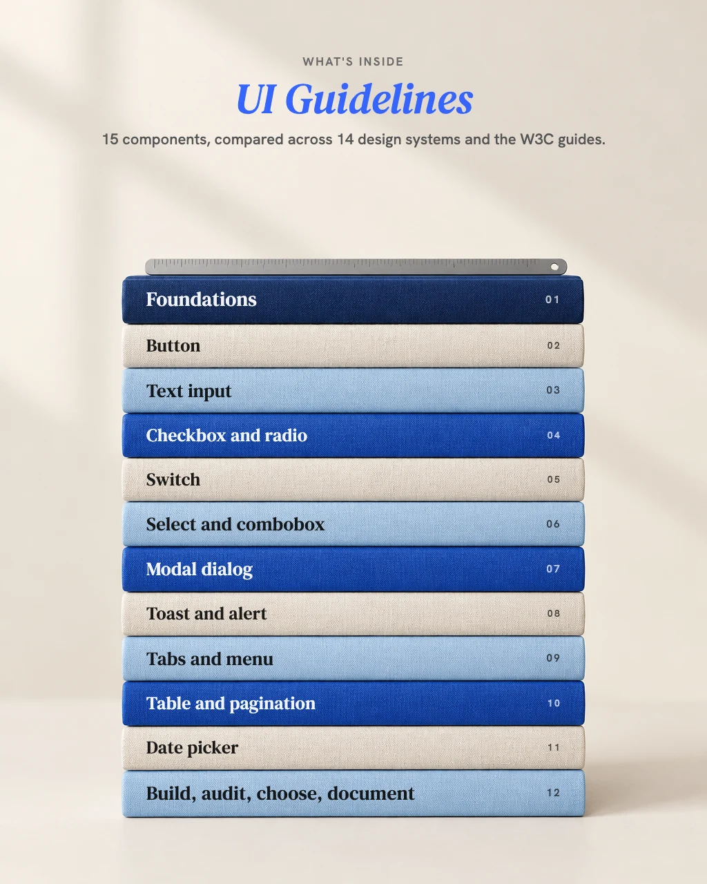
UI Guidelines
Ask AI to build a dropdown and it will build one. It may not tell you that your users needed a radio group, or that the toast it added disappears before a screen reader can read it. UI Guidelines gives the AI you already use a working knowledge of 15 everyday components, from original research across 14 public design systems and the W3C's guidance: what the systems do, with counts, what the W3C patterns require, which WCAG 2.2 criteria apply, where the systems disagree, and what to test.
Not a component library. Specs, reviews and decisions for the components you build, in your own stack.
- Counts from 14 public design systems, never an impression
- The W3C pattern and the WCAG 2.2 criteria for each of 15 components
- Build, audit, choose or document, in your own stack
One payment, no subscription.
Your AI builds, reviews, chooses and documents 15 everyday UI components with counts from 14 public design systems and the WCAG 2.2 criteria behind them, and says what still needs testing.
- Counts from 14 public design systems, never an impression
- The W3C pattern and the WCAG 2.2 criteria for each of 15 components
- Build, audit, choose or document, in your own stack
- One payment, no subscription
- Download straight after paying, and a copy in your inbox
- Free updates within this version
Payment is handled by Stripe. We never see your card number.
Secure payment by Stripe. Card, Apple Pay or Google Pay. Download straight after.
Every skill on the site in one payment. Seven of them share one brand file, so you explain your business once.
- Brand Strategy
- Brand Naming
- Copywriting
- Content Hooks
- Page Planner
- Proposal Builder
- Project Brief
- UI Guidelines
- You save $213.00 on buying them separately
- One payment, no subscription
- All 8 downloads straight after paying, and a copy in your inbox
- Free updates within each version
Payment is handled by Stripe. We never see your card number.
Need all 8? Get the full set, $249.00 $462.00Black Friday, until 30 November
- Works in Claude, ChatGPT and other AI tools that read skills
- One payment, no subscription
AI can build a dropdown. It may not tell you what's missing.
Ask AI for a dropdown and you get one. It may not tell you that your users needed a radio group, or that the toast it added disappears before a screen reader can read it. Most interface bugs are not exotic. A button that is really a link. A modal that loses focus when it closes. A select used where three radio buttons would do. The code was never the hard part. The hard part is knowing what the W3C patterns require, which WCAG 2.2 criteria apply, where the big design systems disagree, and what you still have to test.
Counts, not impressions.
It says how many of 14 public design systems do something, from its own research, and never rounds a count into "most".
Every answer ends with what to test.
Keyboard only, a screen reader, zoom and reflow, an automated scan, and people.
Put your mouse away and fill in your own signup form with the keyboard. Every place focus disappears, or a message vanishes before you've read it, is a finding.
Which one is you?
Front-end developers building components in React, Vue, plain HTML or SwiftUI.
A spec, acceptance checks and the code, using your framework's real APIs.
Product designers specifying a component before handoff.
Every state, the keyboard table and the content rules, written down.
Design system teams writing or reviewing components.
Where 14 systems agree and where they don't, and docs written from your component's real code, with the gaps listed.
Agencies building interfaces for clients.
Reviews ranked from blockers to polish, each tied to a WCAG criterion or a count.
Not for you if you need a certificate.
It is not an accessibility certification or legal advice. That needs a qualified auditor.
Same brief, two answers. A test run, 20 November 2026.
The request: "I need an accessible combobox in React for picking a country from about 200. We use plain CSS, no design system. WCAG 2.2 AA." Both answers built an editable combobox with list autocomplete on the W3C pattern, with working React code and plain CSS. The plain AI's answer was good code. The differences are in what each one claimed, and what each one based it on.
The moment that matters.
The plain AI ended with a table headed "How it maps to WCAG 2.2 AA": 16 rows, each with a "How it's met" column, stated before anyone had tested it. UI Guidelines opened with: "One thing I can't do is promise it meets WCAG 2.2 AA: that needs testing with a keyboard, screen readers and real users."
Native first.
Both offered a native <select> as the alternative. The plain AI called it "still the most accessible option" if you don't need custom styling. UI Guidelines said it is simpler and works well on phones, and to keep it if you want the least code to test.
ARIA pattern and attributes.
The same in both: role="combobox" on the input, aria-autocomplete="list", aria-expanded, aria-controls, aria-activedescendant, a listbox of options with aria-selected, a real <label>, and aria-describedby, aria-invalid and aria-required. UI Guidelines sets aria-controls only while the list is shown.
Keyboard.
Focus and announcements.
Both keep focus in the input and announce the result count and "no results" in a polite status region, without moving focus. The plain AI's message adds "Use up and down arrows to review." UI Guidelines waits for typing to pause before it announces. Typed text that matches no country: the plain AI snaps back to the last valid choice; UI Guidelines shows an error.
WCAG criteria cited.
The plain AI cited more: 20 criteria in its table, plus 2.5.3 in its tests. UI Guidelines cited 14, by number and name, saying which come from its combobox file and which from its shared foundations.
Counts from research.
Testing.
The plain AI's list was strong: 6 steps, four screen reader pairings including JAWS, forced colours and voice control, and two tested libraries to consider. It also said an automated scan catches "roughly a third of issues", with no source. UI Guidelines: 7 steps, adding fast typing and pasting, a free-entry check, and testing with people who use assistive technology.
How the code was checked.
UI Guidelines' code was smoke-tested in a simulated browser (jsdom, React 18.3.1). It was not tested in a real browser or with a screen reader.
A test run, not a customer.
The request was scripted. The plain AI was a general AI assistant with no skill, given the same request in one message.
Three findings from the toast audit test run
"Screen readers never hear the toast."
Ranked Blocker. Why it matters: "a blind user never learns the save worked, or failed."
"A timed toast with no way to keep it (if it ever carries an error or anything needed)."
Ranked Blocker. What it found: "the toast vanishes after 3 seconds. There's no way to pause, extend or turn off the timer, and it doesn't pause on hover or focus."
"White text on #4caf50 is too faint."
Ranked Serious. What it found: "#ffffff on #4caf50 is about 2.78:1 (calculated). That fails 4.5:1 for normal text, and 3:1 for large text too."
You can, and the code may be good. What you won't get is the research behind it: how many of 14 systems do it, where they disagree, which WCAG 2.2 criteria apply, and a plain line on what still needs testing, instead of a table saying each criterion is met. UI Guidelines runs inside the AI you already use. It's the same AI, given research and a method: find your context first, use the platform first, report counts, and never claim your UI is accessible or compliant.
What you get: the answer, and what it rests on
1. A spec fitted to your stack.
Anatomy, props, states, a keyboard table, roles and acceptance checks, and the code if you want it.
2. The counts behind it.
How many of 14 systems do each thing, what they call it, and where they disagree.
3. The criteria that apply.
The W3C pattern and the WCAG 2.2 criteria, by number and name.
4. What still needs testing.
Keyboard only, screen readers, zoom and reflow, an automated scan, and people.
Plus, in the download.
The skill, with 15 component files, shared foundations and every source listed with the date read; a quickstart, an install guide, three sample outputs from the test runs (a combobox build, a toast audit and a select-or-radio choice), license, terms, changelog and support. Free updates for every version 1 release.
Four ways in
Tell your AI what you need. It asks, in one message, only what isn't clear from your request or your code, then picks the route.
Build.
A spec for a component, fitted to your stack and your design system, with acceptance checks and, if you want it, the code.
Audit.
A review of your code, screens or a live page, with findings ranked from blockers to polish, each tied to a WCAG criterion or a count. It fixes only when you say yes.
Choose.
Which component fits the job: radio or select, toast or banner, tabs or a menu, date picker or date fields.
Document.
Docs for your own design system, written from your component's real code, with the gaps listed.
Already have a design system?
It keeps your prop names and patterns, and suggests a change only for a redesign or a real accessibility or usability problem, and says which.
How it works
It tells you in one plain sentence what it's about to do, then does it.
Give your context.
Platform, framework, design system and accessibility target. Give no target and it assumes WCAG 2.2 AA, and says so.
It reads only what the job needs.
The shared foundations and the component files involved, mapped from your words: "dropdown", "snackbar", "toggle".
It answers with counts and criteria.
How many of 14 systems do it, what the W3C pattern says, and which WCAG 2.2 criteria apply. Where the systems disagree, it says what it recommends and why.
It ends with what to test.
And how: keyboard, screen readers, zoom, an automated scan, and people.
What it will not do
Claim your UI is accessible or compliant.
It says what was checked and what still needs testing with real people and assistive technology.
Invent APIs.
It uses your framework's real APIs, or says when it is unsure and gives the plain HTML or ARIA equivalent.
Override your design system.
Not without a reason it can name.
Guess at a count.
It cites only counts in its component files, and never says "most" without the number.
Reproduce any design system's documentation.
Facts and counts, in its own words. For a system's exact wording, it points you to the page.
Answers to your questions
Which components does it cover?
15: button, text input, checkbox, radio group, switch, select, combobox, modal dialog, toast, alert, tabs, menu, table, pagination and date picker. Plus shared rules for labels, states, focus, keyboard, errors, target size, contrast and motion.
Which design systems did the research read?
Material Design 3, IBM Carbon, Shopify Polaris, Atlassian, GOV.UK, Adobe Spectrum, Microsoft Fluent 2, GitHub Primer, Apple Human Interface Guidelines, Ant Design, Salesforce Lightning, Bootstrap, Radix Primitives and Base Web, with the W3C's ARIA Authoring Practices and WCAG 2.2. Counts reflect each system's public documentation on the date read (for Bootstrap, its 6.0 alpha docs); systems change.
Will it tell me my UI meets WCAG 2.2 AA?
No. It says what WCAG requires and the W3C patterns recommend, and whether the code appears to meet it. Conformance needs testing with assistive technology and real users, and certification needs a qualified auditor.
Can it review screenshots?
Yes, as well as code and live pages. From a screenshot it can't judge keyboard behaviour or screen reader output, and it says so.
Does it replace my design system?
No. It works with the one you have, keeps its names, and fits specs and code to your stack.
Which AI tools does it work in?
Claude, Claude Code, ChatGPT on plans that support skills, and other tools that read SKILL.md skills, such as Codex, Cursor and Gemini CLI. The install guide covers each one.
The research behind this skill

Original research by Brand Professor.
Done for this product from the public documentation of 14 design systems and the W3C's ARIA Authoring Practices and WCAG 2.2, read page by page in November 2026. Facts are recorded in the skill's own words, and every source is listed with the date read. Before release, a separate check re-counted five component pages against the research, and three test runs led to corrections. The design systems named belong to their owners, who do not endorse this product.
Verify: brand-professor.com
What this job costs to have done.
Published market rates, stated as ranges. A person brings their own judgment; UI Guidelines brings a working method to the AI you already use, for one payment.
Ranges as published by each source, checked 20 and 21 November 2026. Prices vary by market, scope and experience.
Your component works for you. The test is whether it works for everyone else.
Secure payment by Stripe. Card, Apple Pay or Google Pay. Download straight after.
Every skill on the site in one payment. Seven of them share one brand file, so you explain your business once.
- Brand Strategy
- Brand Naming
- Copywriting
- Content Hooks
- Page Planner
- Proposal Builder
- Project Brief
- UI Guidelines
- You save $213.00 on buying them separately
- One payment, no subscription
- All 8 downloads straight after paying, and a copy in your inbox
- Free updates within each version
Payment is handled by Stripe. We never see your card number.
Need all 8? Get the full set, $249.00 $462.00Black Friday, until 30 November
Related skills
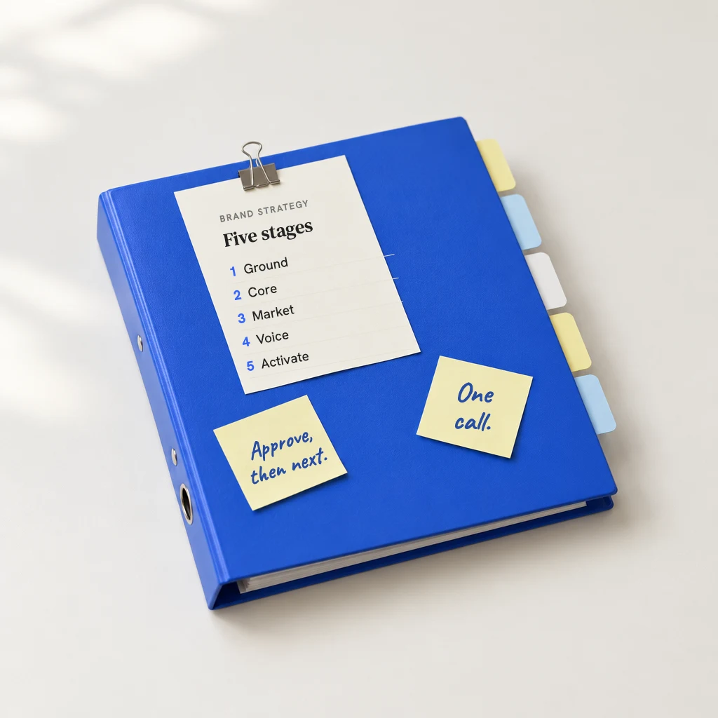
Your AI works out what you need first: a full brand strategy built from scratch, one problem fixed, or one decision made by a deadline. It asks before it answers, and keeps one brand file across every session.
Your AI asks before it writes, picks one angle, writes in your voice and never makes up a quote, a number or an offer.

Your AI writes 50 or more openings from your own stories and numbers before it judges one, names what each one promises, and never makes up a result.